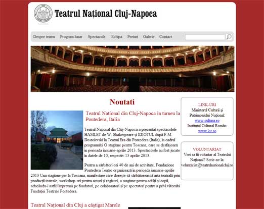
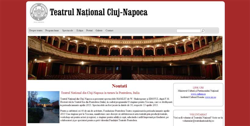
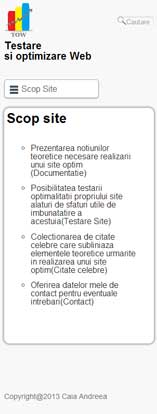
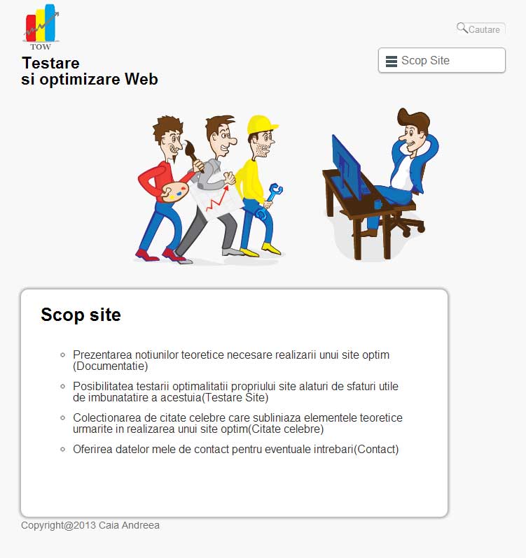
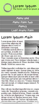
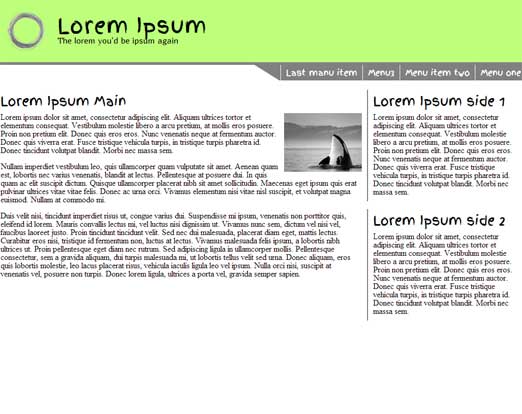
This site displays the work of all participants at the Web Design and Optimisation course held in the second semester of the academic year 2012-2013. Here it is highlighted the responsive nature of these sites.
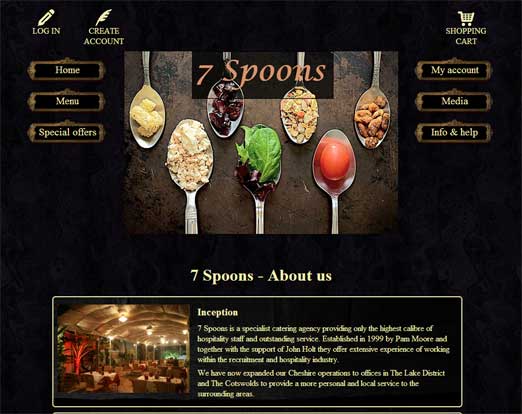
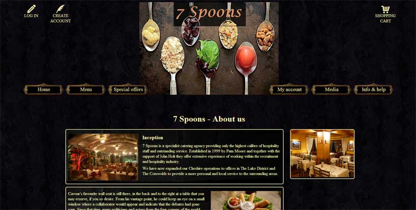
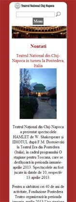
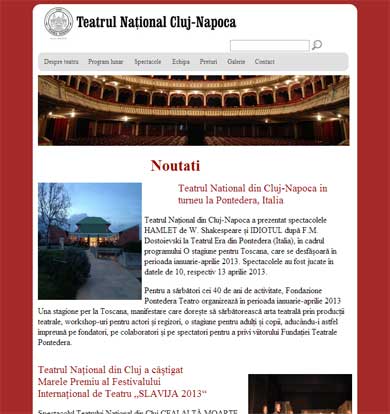
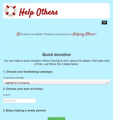
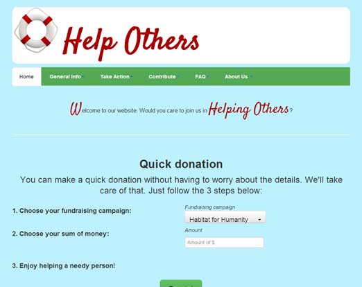
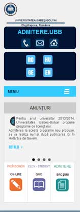
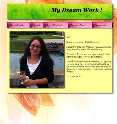
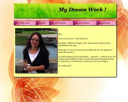
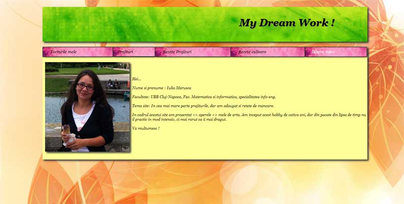
The screenshots correspond the following formats:
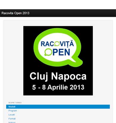
Smartphone - 320px |
Tablet - 768px |
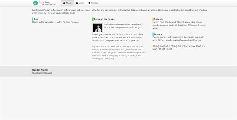
Netbook - 1024px |
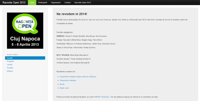
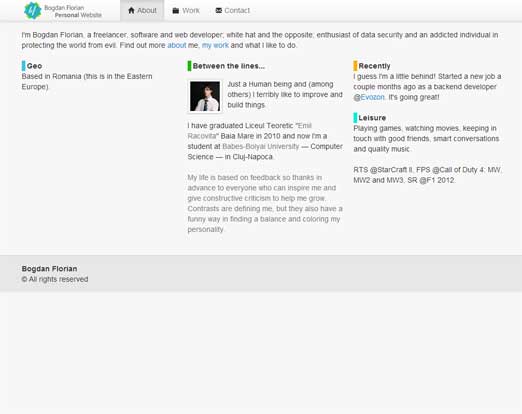
Desktop - 1600px |
I thank all the participants!