CSS level 3 & beyond ..
History of CSS
- CSS level 1 – original CSS
- CSS level 2
- CSS level 2 Revision 1 (CSS 2.1) – up to CSS 2.1 monolithic structure
- CSS level 3 – specification structured in modules
- Modules can evolve independently
- Many modules are implemented in browsers before they reach the W3C recommendation status
- Some modules are already level 4 (e.g. Colors, Selectors)
Full CSS described at http://www.w3.org/Style/CSS/specs.en.html
Summary at: http://www.css3.info
Current recommendation: https://www.w3.org/TR/css-2018/
CSS modules (selection)
- CSS Color
- CSS Namespaces
- CSS Selectors
- CSS Media Queries
- CSS Backgrounds & Borders
- CSS 2D Transformations
- CSS Transitions
- CSS Animations
- CSS 3D Transformations
- CSS Flexible Box Layout
- CSS Fonts
- CSS Text
- CSS Grid Layout
- CSS Image Values and Replaced Content
CSS Selectors (1)
- E[attr^=“str”] - an E element whose “attr” attribute begins with “str”
- E[attr$=“str”] - an E element whose “attr” attribute ends with “str”
- E[attr*=“str”] - an E element whose “attr” attribute contains “str”
- E[attr=“str”] – an E element whose “attr” attribute is equal to “str”
- E:nth-child(n) - an E element, the n-th child of its parent
- E:nth-last-child(n) - an E element, the n-th child of its parent, counting from the last one
- E:nth-of-type(n) - an E element, the n-th sibling of its type
- E:nth-last-of-type(n) - an E element, the n-th sibling of its type, counting from the last one
- E:first-child - an E element, first child of its parent (in CSS2.1)
- E:last-child - an E element, last child of its parent
CSS Selectors (2)
- E:first-of-type - an E element, first sibling of its type
- E:last-of-type - an E element, last sibling of its type
- E:only-child - an E element, only child of its parent
- E:only-of-type - an E element, only sibling of its type
- E:empty - an E element that has no children
- E:not(s1,s2,..) - an E element that does not match selectors s1,s2,..
- E:is(s1,s2,..) - an E element that matches one of selectors s1,s2,..
- E > F - an F element child of an E element (in CSS2.1)
- E + F - an F element immediately preceded by an E element (in CSS2.1)
- E ~ F - an F element preceded by an E element
CSS Selectors (3)
- * - selects everything, every tag
- E:has(> F) – an E element that has an F child
- E[attr="str" i] – an E element with an attribute "attr" equal cu "str" (case insensitive)
- E[attr="str" s] – an E element with an attribute "attr" equal cu "str" (case sensitive)
- E:current, E:past, E:future - timeline selectors, select an element in a time-dimensional canvas; Ex.:
:current(p) { background : yellow } - selects and colors the paragraph of text that is currently read in a speech rendering of the document
Gradient images - linear
- Linear gradient
background: linear-gradient([direction], color-stop1, color-stop2,…)- direction=< angle > | [to] < side-or-corner >
- there can be several direction arguments;
- angle=0deg, 90deg, 100deg, ..
- side-or-corner=bottom, top, right, left
- colorr-stops can be followed by a percent or length in pixels specifying the position of the color in the gradient, along the gradient line
- color-stop=blue, red, .., rgb(rrr, ggg, bbb), rgba(rrr, ggg, bbb, aaa) where aaa=1 (no transparency) and aaa=0 (full transparency)
- Linear repeating gradient
background: linear-repeating-gradient ([direction], color-stop1, color-stop2,…)- the parameters are the same as for the simple linear gradient
Gradient images - radial
- Radial gradient (center/elliptical gradient defined by its center)
background: radial-gradient(<center position> <shape> <size>, color-stop1, color-stop2, …)- <center position> =center(default) or position given with 2 points
- shape=circle or ellipse
- size=the radius(es) of gradient as <length> | <percentage> or closest-side, farthest-side, closest-corner, farthest-corner
- Radial repeating gradient
background: radial-repeating-gradient(<center position> <shape> <size>, color-stop1, color-stop2, …)
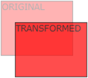
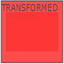
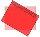
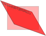
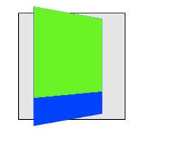
2D Transforms (1)
- we can translate, scale, turn, spin and stretch elements
- Chrome uses –webkit- prefix
- CSS properties:
- transform : transform-function1 transform-function2 .. - > applies a 2D or 3D transformation to an element
- transform-origin : <percentage> | <length> | left | center | right | top | bottom - > allows the user to change the position on transformed elements (moves the point of origin of transformation)
- 2D transform functions - translate:
- translate(x,y) – moves the element along the X and Y axes
- translateX(x) – moves the element along the X axis
- translateY(y) – moves the element along the Y axis
2D Transforms (2)
- 2D transform functions – scale, skew, rotate, general :
- scale(x,y) – changes the width to x times the original and the height to y times the original
- scaleX(x) – changes the width to x times the original
- scaleY(y) – changes the height to x times the original
- rotate(angle) – rotate element by angle;
ex.: rotate(45deg); - skew(x-angle,y-angle) – skew transform along the X and Y axes
- skewX(x-angle) – skew transform along the X axis
- skewY(y-angle) – skew transform along the Y axis
- matrix(n,n,n,n,n,n) – general transformation
3D Transforms (1)
- apply 3D transforms to elements
- Chrome uses –webkit- prefix
- CSS properties:
- transform : transform-function1 transform-function2 ..
- transform-origin : <percentage> | <length> | left | center | right | top | bottom
- transform-style : flat | preserve-3d -> a nested child element will not preserve its 3d position (‘flat’) or it will preserve it position (‘preserve-3d’)
- perspective : none | number -> how many pixels the element is placed from the viewport
- perspective : x y -> define the view’s x- and y-axis for nested elements; x,y= left | center | right | length | percent
3D Transforms (2)
- 3D transform functions:
- translate3d(x,y,z)
- translateX(x)
- translateY(y)
- translateZ(z)
- scale3d(x,y,z)
- scaleX(x)
- scaleY(y)
- scaleZ(z)
- rotate3d(x,y,z,angle)
- rotateX(angle)
- rotateY(angle)
- rotateZ(angle)
- perspective(n)
- matrix3d(n,n,n,n,n,n,n,n,n,n,n,n,n,n,n,n) – 3D transform 4x4 matrix
Transitions - properties
- add effects when changing from a style to another (e.g. when :hover is used), like flash or javascript
- Style properties used:
- transition-property : comma separated list of property names to which transition is applied
- transition-duration : how long it take the transition to be completed (ex.: transition-duration : 2s)
- transition-delay : when transition will start (ex.: transition-delay: 1s)
- transition-timing-function : defines the speed of the transition; values: linear|ease|ease-in|ease-out|ease-in-out|cubic-bezier(n,n,n,n)
- transition : shorthand property for the above properties
Transitions - examples
- simple example:
div { transition-property: width; transition-duration: 5s; } div:hover { width: 100px } - multiple properties example:
div {
	width: 20px;
	transition: width 3s, transform 3s;
}
div:hover {
	width: 100px;
	transform: rotate(90deg);
}
Animations - properties
- @keyframes : defines the frames of the animation
- animation-name : defines the animation name, used in @keyframes
- animation-duration : duration of the animation
- animation-timing-function : defines the speed of the transition; values: linear|ease|ease-in|ease-out|ease-in-out|cubic-bezier(n,n,n,n)
- animation-delay : startup delay (in seconds)
- animation-iteration-count : how many times the animation is played
- animation-direction : the direction in which animation is played (normal | reverse | alternate | alternate-reverse)
- animation-play-state : running or pausing the animation
- animation – shorthand property
Animations - @keyframes
@keyframes name-of-animation {
		keyframe-selector {
			property: value;
			…
			property: value;
		}
		…
		 keyframe-selector {
			property: value;
			…
			property: value;
		}
}
Duration from 0% to 100%.
property is a CSS property.
Animations - example
@keyframes move {
		0% { left: 100px; }
		40% { left: 130px; }
		100% { left: 150px; }
}
div {
	animation: move 5s;
}
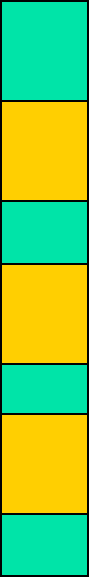
Multiple columns
- Firefox uses prefix –moz- and Chrome uses –webkit-
- Useful properties:
- column-count : no. of columns an element is divided
- column-fill : how to fill columns (balance | auto)
- column-gap : space between columns (dimension)
- column-rule-color : color of rule between columns (same as border-color)
- column-rule-style : style of rule between columns (same as border-style)
- column-rule-width : width of rule between columns (same as border-width)
- column-span : span of a column
- column-width : width of columns
- columns : shorthand for column-width and column-count
Multiple columns - example
div {
	column-count : 3;
	column-rule-color : black;
	column-rule-style : dotted;
	column-rule-width : 1px;
}
div {
	columns: 40px 2;
}
Borders
- border-radius : (<length> | <percent>) {1,4} / (<length> | <percent>) {1,4}
create rounded corners; there are two radix values for each corner : top-left, top-right, bottom-right, bottom-left
ex. div { border-radius : 10px 10px 20px 20px / 5px 5px 10px 10px } - box-shadow : h-shadow v-shadow blur spread color inset
adds a inner/outer shadow to a box;
ex. div { box-shadow : 2px 2px 5px #eeffdd } - border-image : source slice width outset repeat
source=image used for border; slice=4 inward offsets of the border image for top, bottom, left and right sides; width=4 widths of the border image for top, bottom, left and right sides; outset=4 values, the amount the border image extends outside the border of the box
Background and sprites
- CSS3 allows to have several background images for an element
- Sprites are several images contained in one image which can individually be used as backgrounds by setting different values for background-position; see example..
Text shadow & Box shadow
- text-shadow : h-shadow v-shadow blur color;
- Ex.:
div { text-shadow: 2px 2px 4px #ff00dd; } - box-shadow : h-shadow v-shadow blur spread color
- Ex. :
div {
	box-shadow: 4px 6px 6px -2px #aaaaff;
}
CSS flexbox display
- allows the contents of a container to be displayed in a flexible grid (organized in rows and/or columns)
<div class="flexdiv">
<div> 1 </div>
<div> 2 </div>
</div>
.flexdiv {
	display: flex;
	flex-direction: column | column-reverse | row | row-reverse;
	flex-wrap: nowrap | wrap | wrap-reverse;
	justify-content: center | flex-start | flex-end; // align horizontally
	align-items: center | flex-start | flex-end; // align vertically
}
More flex..
- flex-direction: row (default)
- flex-direction: column
- Align horizontally:
justify-content: flex-start | flex-end | center | space-between | space-around | space-evenly
[space-between/around/evenly regulate space between flex components] - Align vertically:
align-items : flex-start | flex-end | center | stretch | baseline

Even more flex ..
- Check https://css-tricks.com/snippets/css/a-guide-to-flexbox/
Beyond CSS : CSS preprocessors
- using functions, variables, inheritance, code reusability, operators, if, loops in CSS ?
- extend CSS syntax (compiled to standard CSS by a preprocessor written in node.js, ruby etc.)
- Stylus
- Compass
- Less
- Sass
CSS preprocessors, example (less)
@font-size: 16px;

.bordered (@width) {
	border: @width solid #ddd;
	&:hover {
		border-color: #999;
	}
}

h1 { .bordered(5px);
       font-size: @font-size;
}
Responsive web design
- Document should look good on any device (desktop, tablet, phone)
- Use CSS to shrink, enlarge, hide or move html content in order to look good on any screen
- Setting viewport:
<meta name="viewport" content="width=device-width, initial-scale=1.0">
- sets the width of the page to follow the screen width of the device
- sets the initial zoom level to 1 (no zoom)
- Do not rely on a particular viewpoint
- Use relative (percentage, %) dimensions: width, height
- Use flexbox for layout
- Use media-querries to apply different styles to large/small screens
Responsive web design (2)
- Use relative units for dimensions:
- percentages: Ex. width: 100%
- relative to fontsize: em (relative to the root of the document) and rem (relative to the parent’s font-size)
- relative to viewport: vw, vh, vmin, vmax
- NOT: px, pt, cm, mm, in (these are absolute units)
Responsive web design (3)
- Use @media to apply css style only if a condition is met
@media only screen and (max-width: 500px) {
    #div1 {
        width: 100%;
    }
}

@media only screen and (min-width: 500px) {
     ….
}
@media only screen and (orientation: landscape) {
     …
}
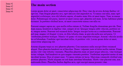
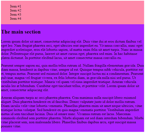
Responsive design. Media query example
<style>
body { display: flex; }
#left {width: 25%; background-color: #ff88aa}
#main {width: 75%; background-color: #aa22ff}

@media screen and (max-width: 800px) {
    body {  display: flex;
                flex-direction: column; }
    #left, #main { width: 100%; }
}
</style>
<body>
	<section id=“left”> …. </section>
	<section id=“main”> …. </section>
</body>
CSS neat typography: web fonts
- see Google web fonts: https://fonts.google.com/
- usage example:
<link rel="stylesheet" type="text/css"
                href=https://fonts.googleapis.com/css?family=Jura>
<style>
    body {
		color: #cfd2da;
    	font-family: 'Jura', sans-serif;
    	font-size: 0.9rem;
     }
</style>
Neat CSS icons: google icons
<link rel="stylesheet" href=”https://fonts.googleapis.com/icon?family=Material+Icons”>

<i class="material-icons" style="font-size:48px;color:red"> folder </i>
<i class="material-icons" style="font-size:48px;color:red">  cloud_upload </i>
Neat CSS icons: fontawesome
<link rel="stylesheet" href=https://cdnjs.cloudflare.com/ajax/libs/font-awesome/4.7.0/css/font-awesome.min.css>

<i class="fa fa-car" style="font-size:60px;color:red;">  </i>

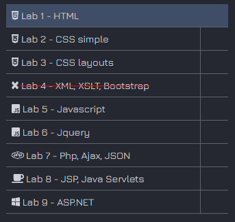
More fontawsome ..
<script defer src=”https://use.fontawesome.com/releases/v5.0.8/js/all.js”> </script>
<li> <div>
      <a href="#" id="1">
          <i class="fab fa-html5"> </i>
           Lab 1 – HTML
      </a>
</div>  </li>
<li> <div>
        <a href="#" id="2">
            <i class="fab fa-css3-alt"> </i>
             Lab 2 - CSS simple
        </a>
</div> </li>
...